Howdy y'all!
We are glad to announce that we have a fantastic Dev Diary from our friends at Lab42 where we will cover the long anticipated and much sought after UI and UX for the Console version releasing soon! Lab42 have been hard at work and there is not much time left until release, so we hope you enjoy the information and vision they have presented for you. Now with screenshots!
As you would expect, user interface and controls were core components of the adaptation from PC to console. One of the main aims was to create a UI that was easily accessible and facilitated fluid gameplay. There is no set standard for UI and controls for Grand Strategy Games on console, with most approaches being subjective and as a consequence we’ve taken an approach that suited the unique Crusader Kings Gameplay.
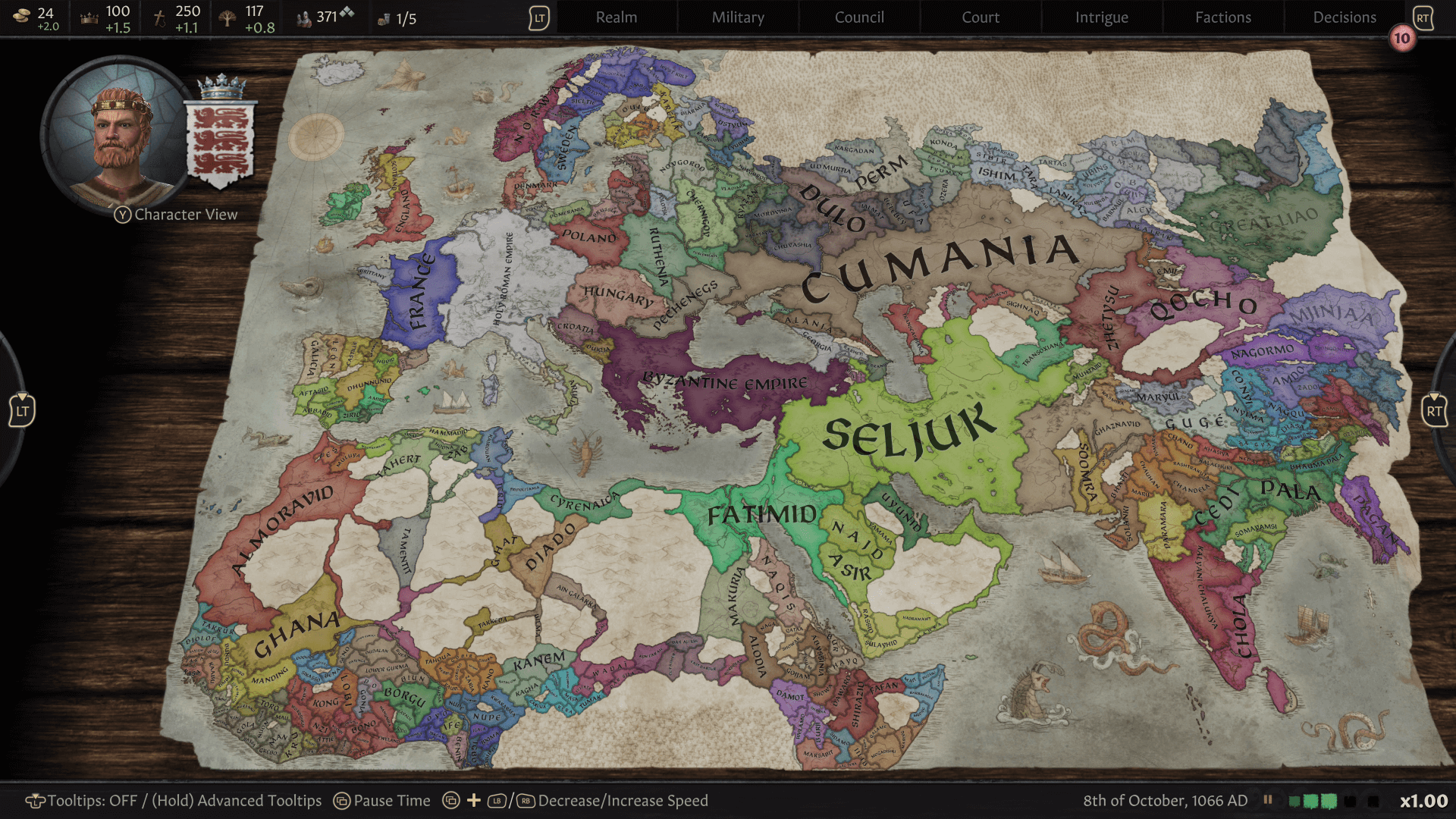
This started with a control hierarchy that marries UI and button control placement, for example ... using shoulder buttons for the top tier menus – the Command Bar – and bumpers to tab between sub-menus within the main menus. In addition, the decision was taken to assign controls to unique game functions rather than using lots of contextual buttons. Control prompts specific to each menu, screen / game context are displayed at the bottom of the screen to assist the user. The aim is to provide the player with a lexicon of controls that when learnt facilitate fluid interaction with the game UI and functionality.
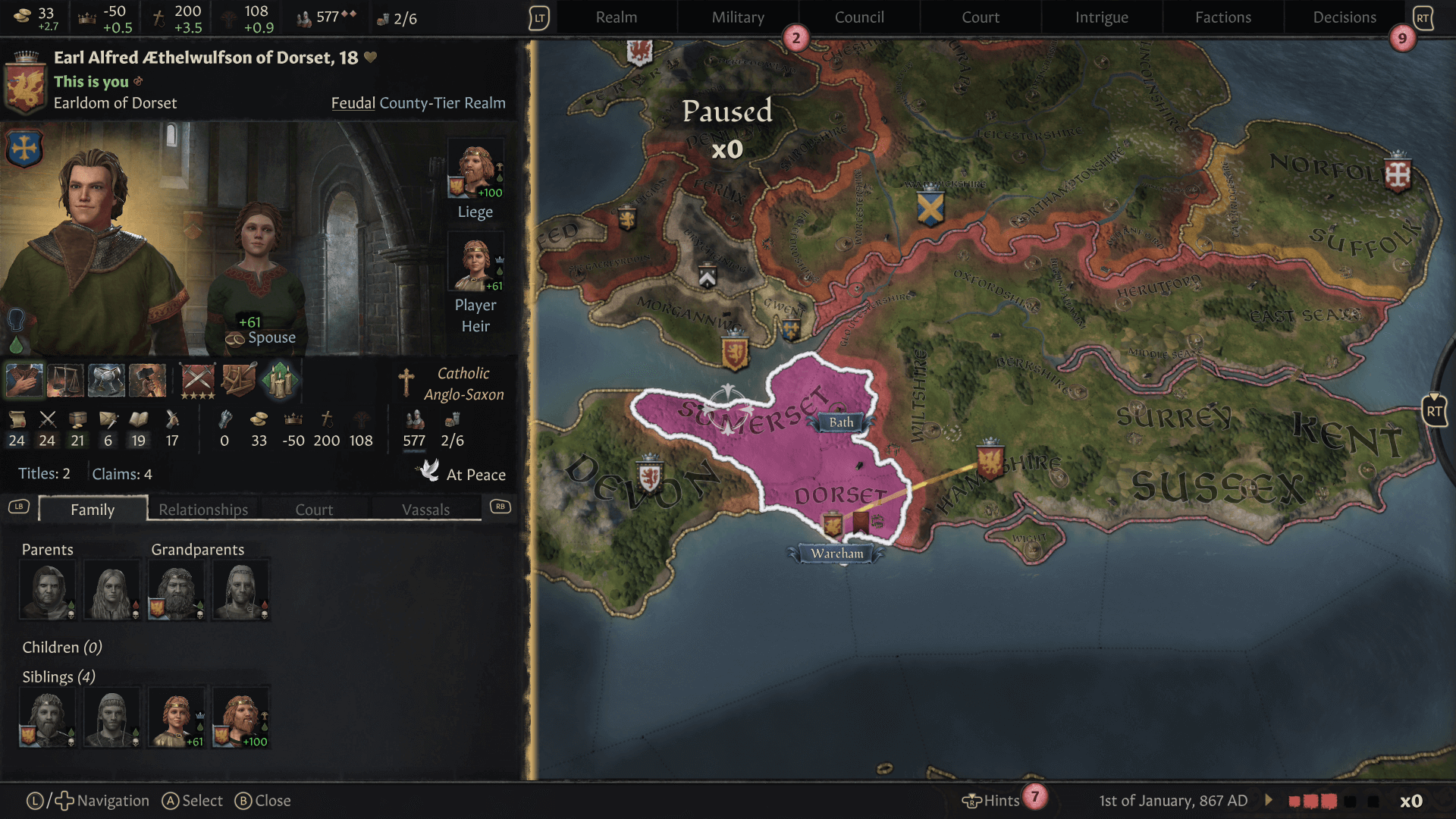
We could've taken a very conservative approach to development, but this was not what Lab42 or Paradox wanted. For example, the conundrum of turning a PC control system and UI into a viable console offering could've involved retaining the PC UI and using the controller thumbstick as a virtual mouse, but this approach was dismissed out of hand. User research also showed how popular the D-Pad was as a means of game navigation, especially when dealing with menus. Moving away from the use of a virtual mouse and freeing up the D-Pad for game navigation (as opposed to invoking menus as used in other console strategy games) presented a new set of challenges to overcome.
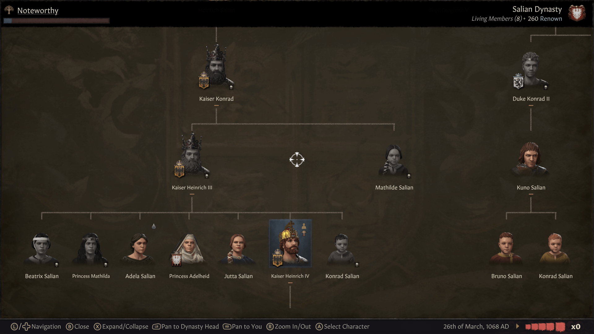
The UI and controls we've adopted is a hybrid approach, leaning on best in class examples as reference and applying them to the unique CK game framework (e.g. top level onscreen menus (the Command Bar), Radials (Character and Maps), and quality of life shortcuts (e.g. Quick Access Bar, Hints, Notifications).
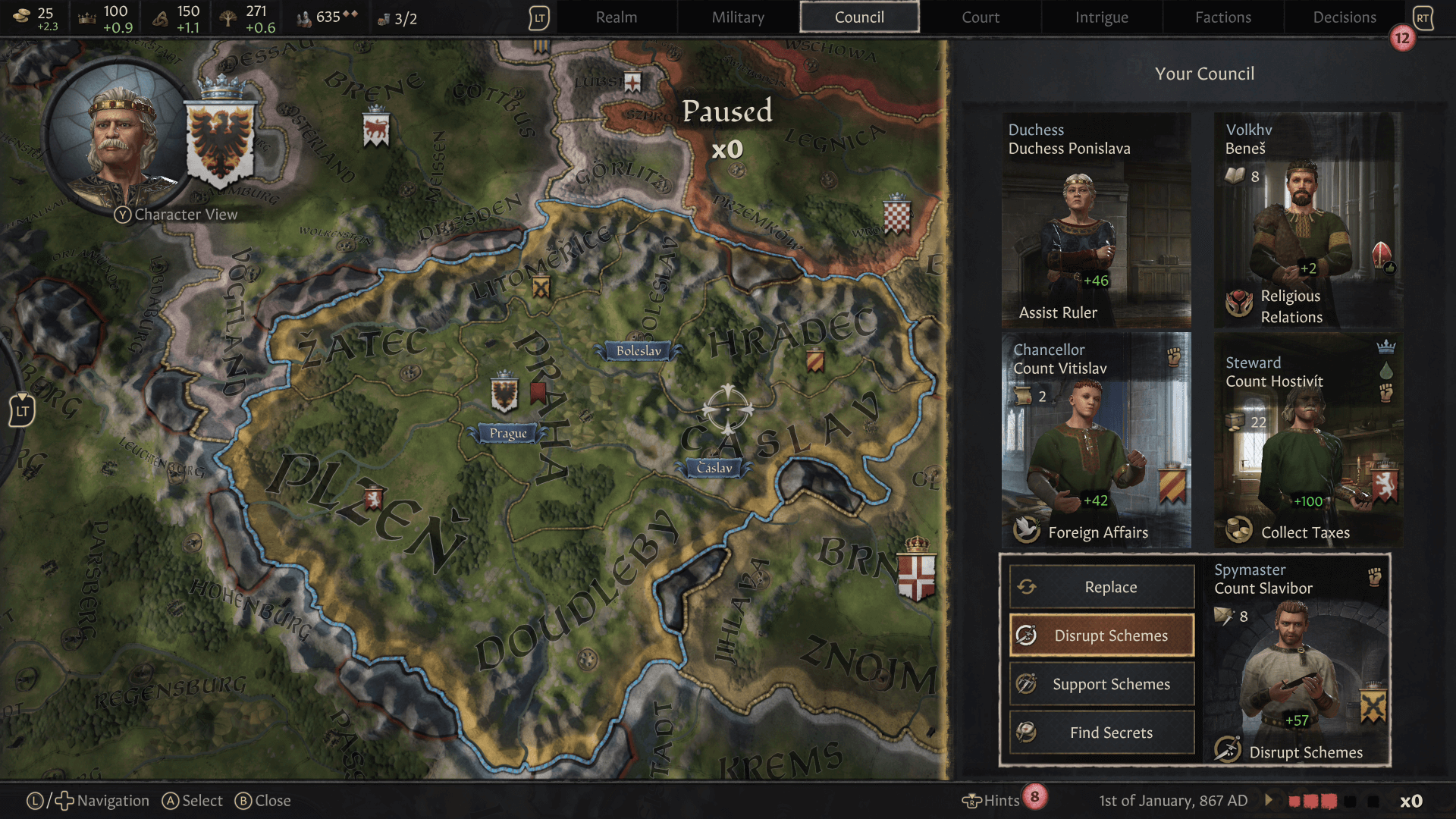
When looking at the Crusader Kings user interface it was clear that most of the community want as much information at their fingertips as possible in order to form and execute game strategy. Flicking between menus, the map and popups is a feature of the PC title that we wanted to retain on console. This is also enhanced by the Radials to access your Character Wheel and another that introduces the Map View Radial accessible at any time from the main gameplay window. Allowing you to quickly change between Map Modes and easily accessing your character features without in-depth menu navigation.
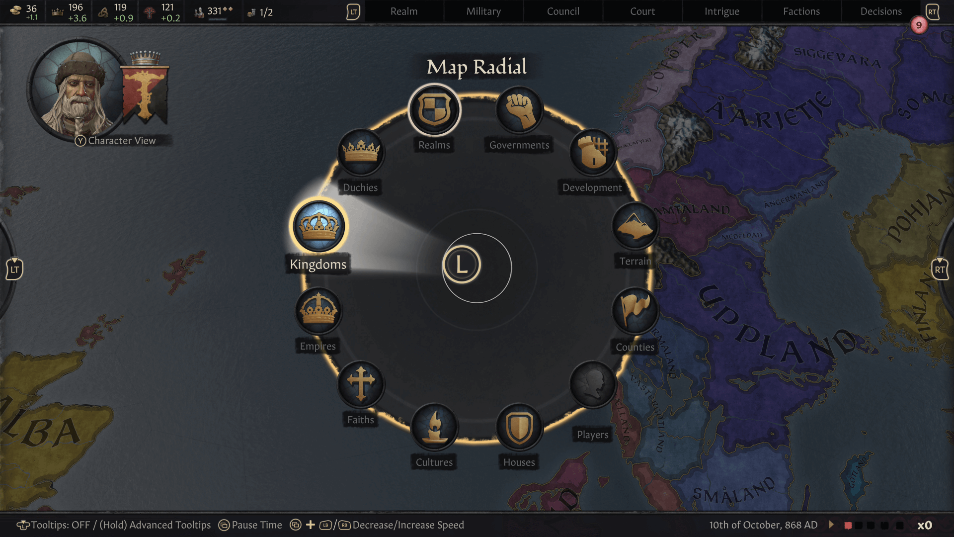
Avoiding the use of lots of fullscreen menus that potentially break the immersion of gameplay was a driver here, and this led to the concept of switching focus being introduced. This essentially allows the gamer to quickly move between any open screen elements as well as allowing easy Map Interaction – a critical component of Crusader Kings gameplay.
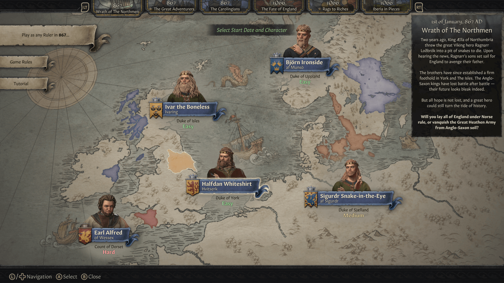
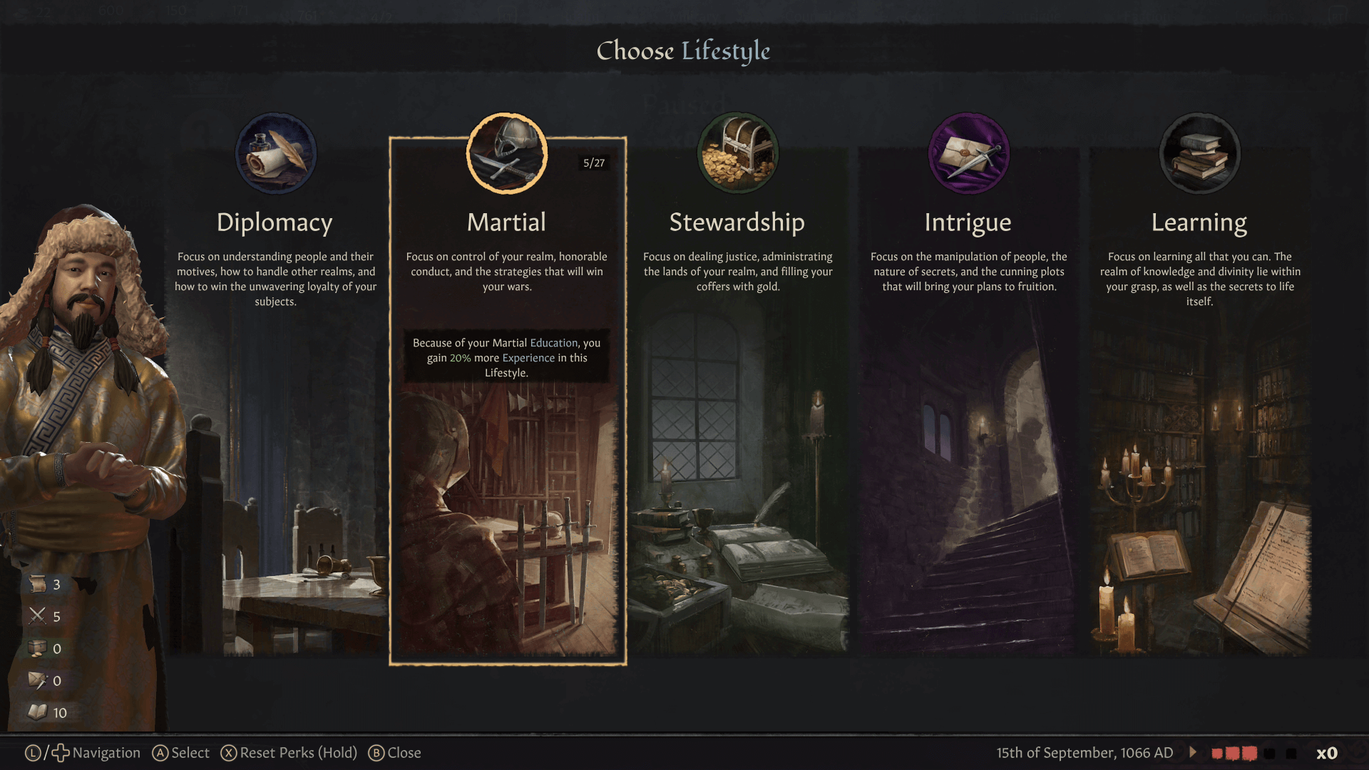
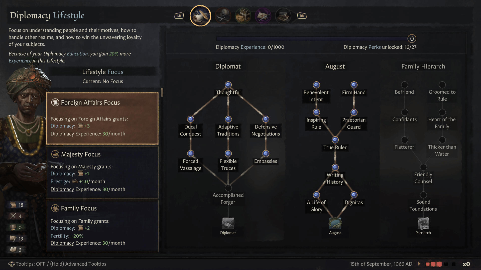
That does it for the Console portion of the Developer Diary fresh and hot from the Lab42 presses!
Click right here to join the Discussion on our Forum or on our Official Discord!
